M+R
My role
UX and Visual Design
M+R has been, in their own words, “raising money + raising hell since 1991.” In plainer terms, they support nonprofits–large and small—through fundraising and supporter engagement, movement building and issue advocacy. But their website was outdated, and didn’t capture their level of experience, expertise, or reputation in the digital space.
Our overarching goal with the redesign was to tell a great story of M+R, so that values-aligned prospects want to work with them, and great people want to work for them. We needed to reorganize and redesign to clarify their services, and breadth and depth of work.
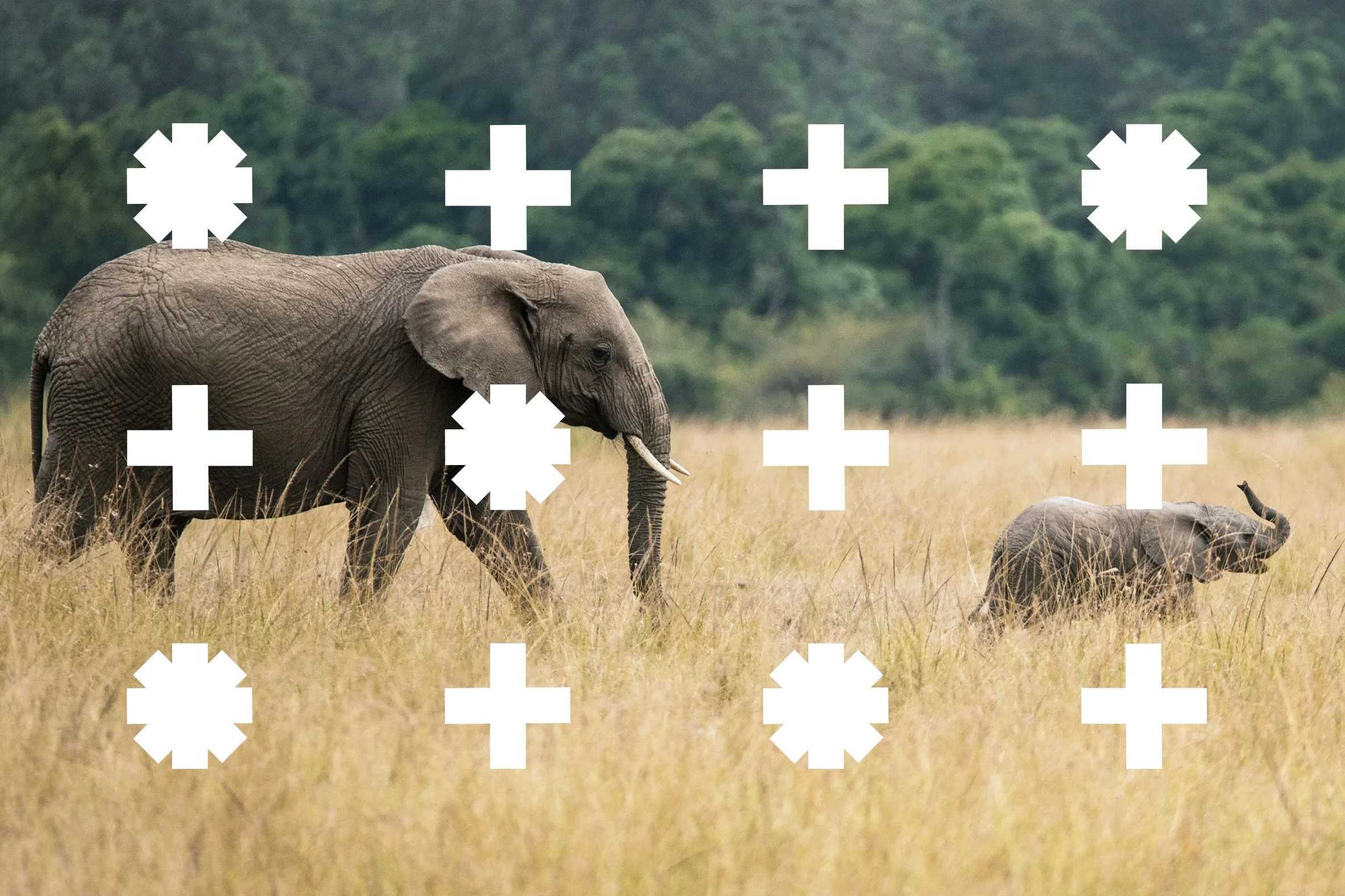
The existing brand system came to life in a new way with a simplified color palette, playful grid, and overlapping shapes inspired by the “+” in their logo.

We created many new user pathways for telling the story of what they do, and accessing more information on services and case studies.
Thought leadership was woven throughout user journeys, always accessible, and always reinforcing the “smart” and “expert” attributes we wanted to convey.
The careers page became a showcase for the fun, quirky culture at M+R, with scattered easter egg animations and interactions

Rather than leading with a traditional gallery of case study images, M+R led with strategic offerings—supported by related services and featured case studies. Each offering and service had a detail page holding relevant descriptions, thought leadership, and projects.
NEXT PROJECT